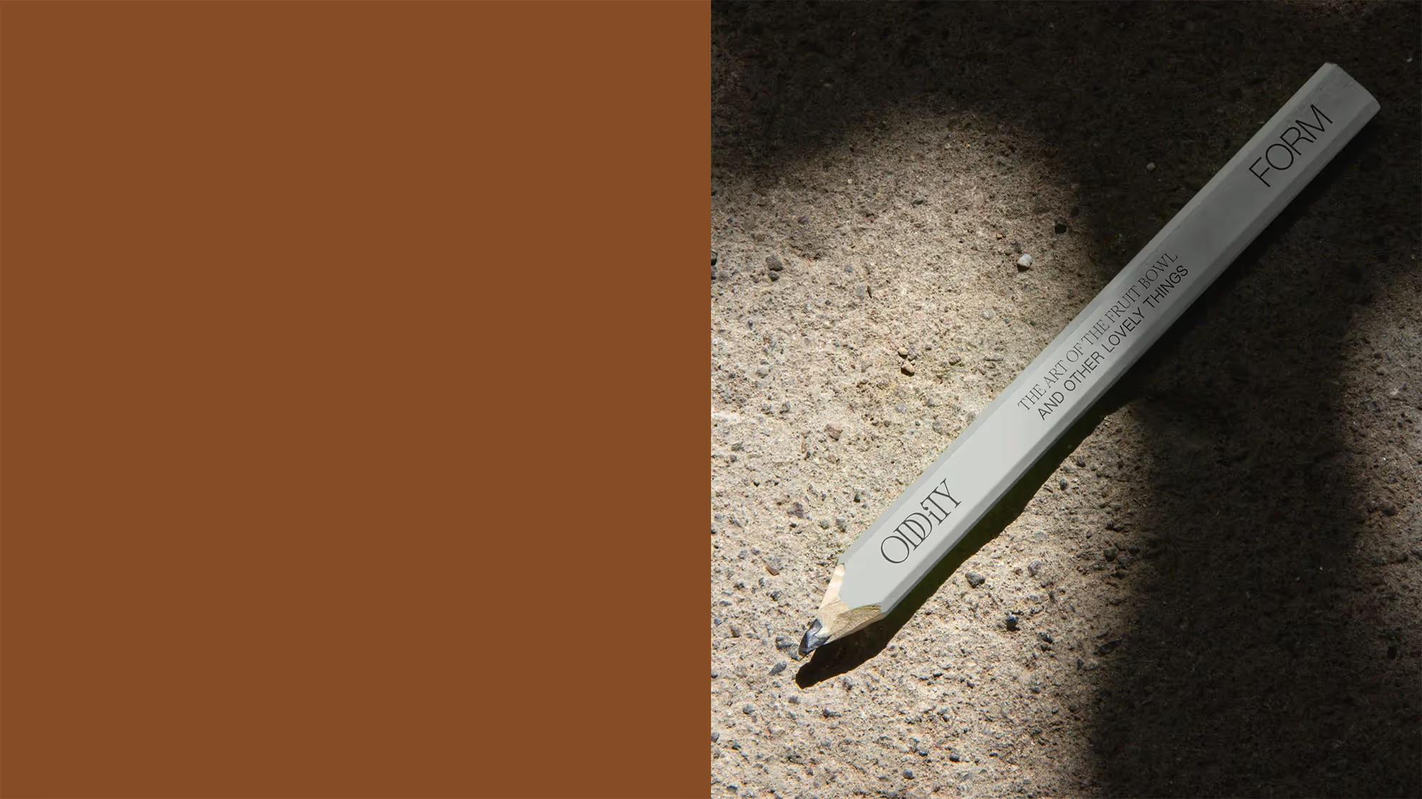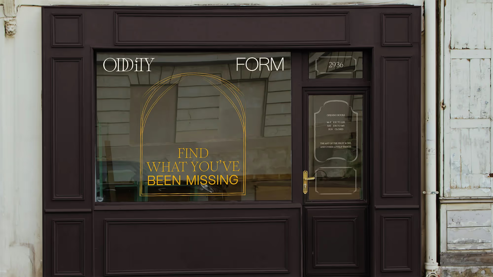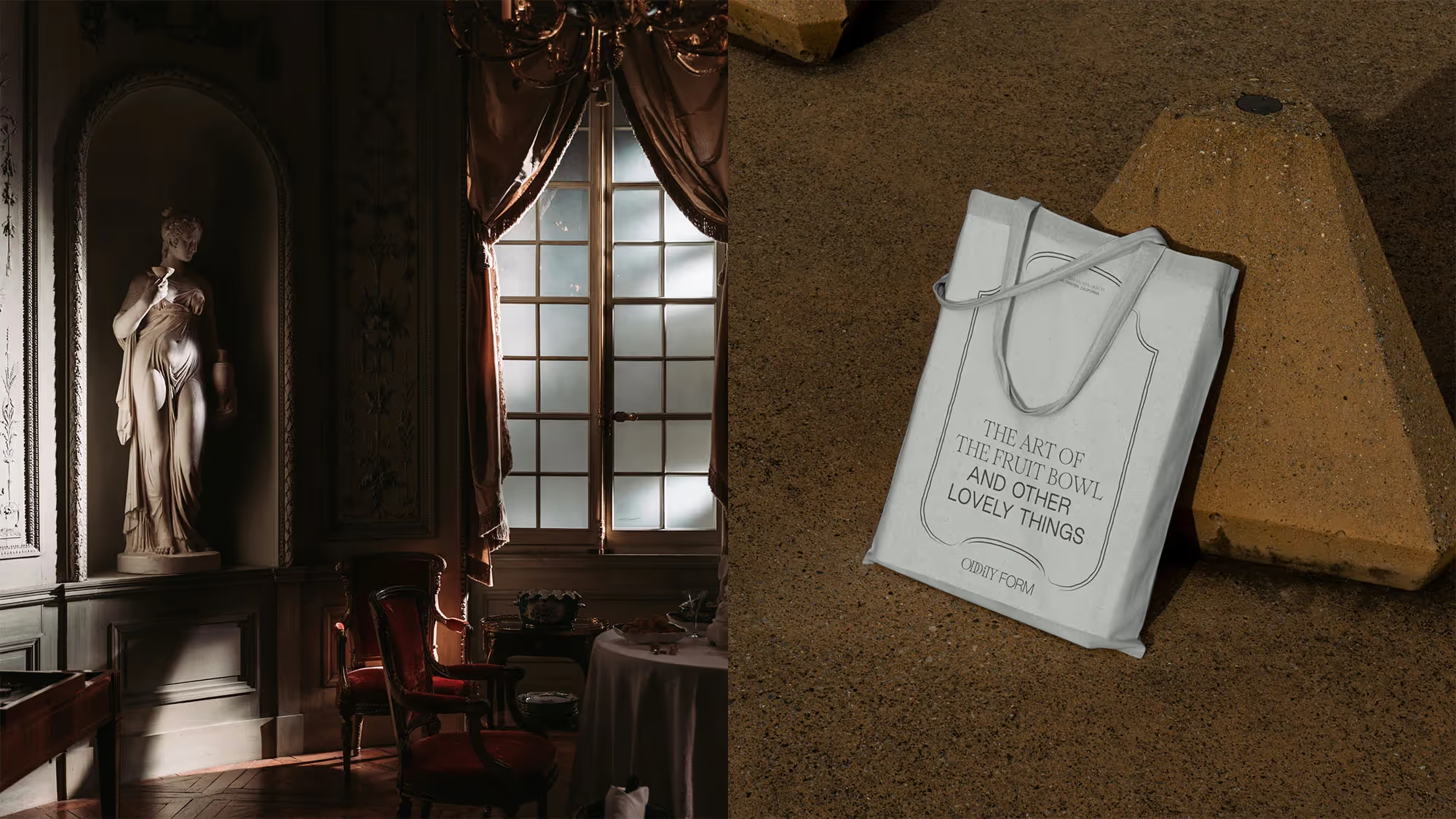

Oddity Form is a high-end interior design firm based in Los Angeles that offers design services and vintage-sourced decorative objects. Kaela Cohen, its owner, approached me to develop a new brand that spoke to her elegant and natural style, with the constraint that it couldn’t be overcomplicated; she needed to be able to develop the brand on her own, as a company of one.
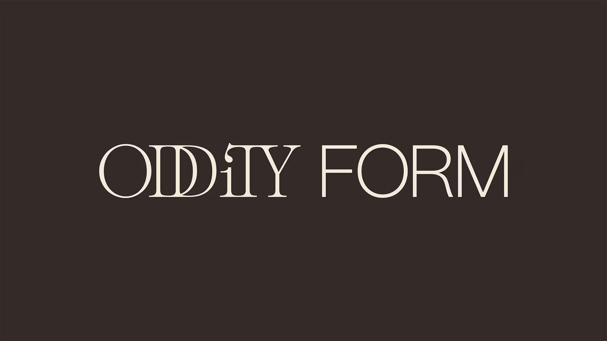
Kaela’s unique interior designs and the rare objects in her collection created the foundation for the brand idea, 'Elusiveness you can’t help but notice.' What grew from this was a brand that focuses on saying more with less and which errs on the side of subtlety.
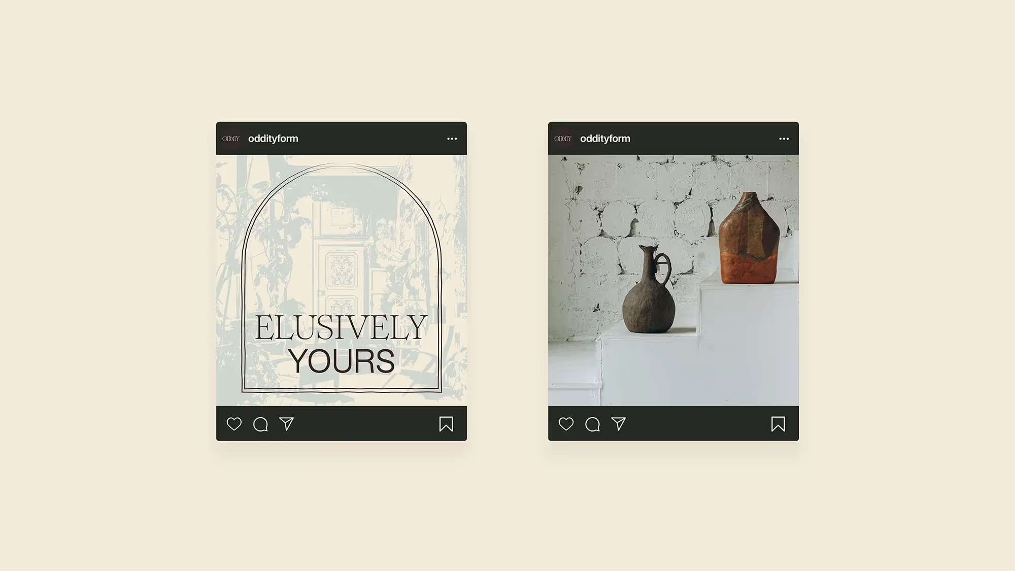
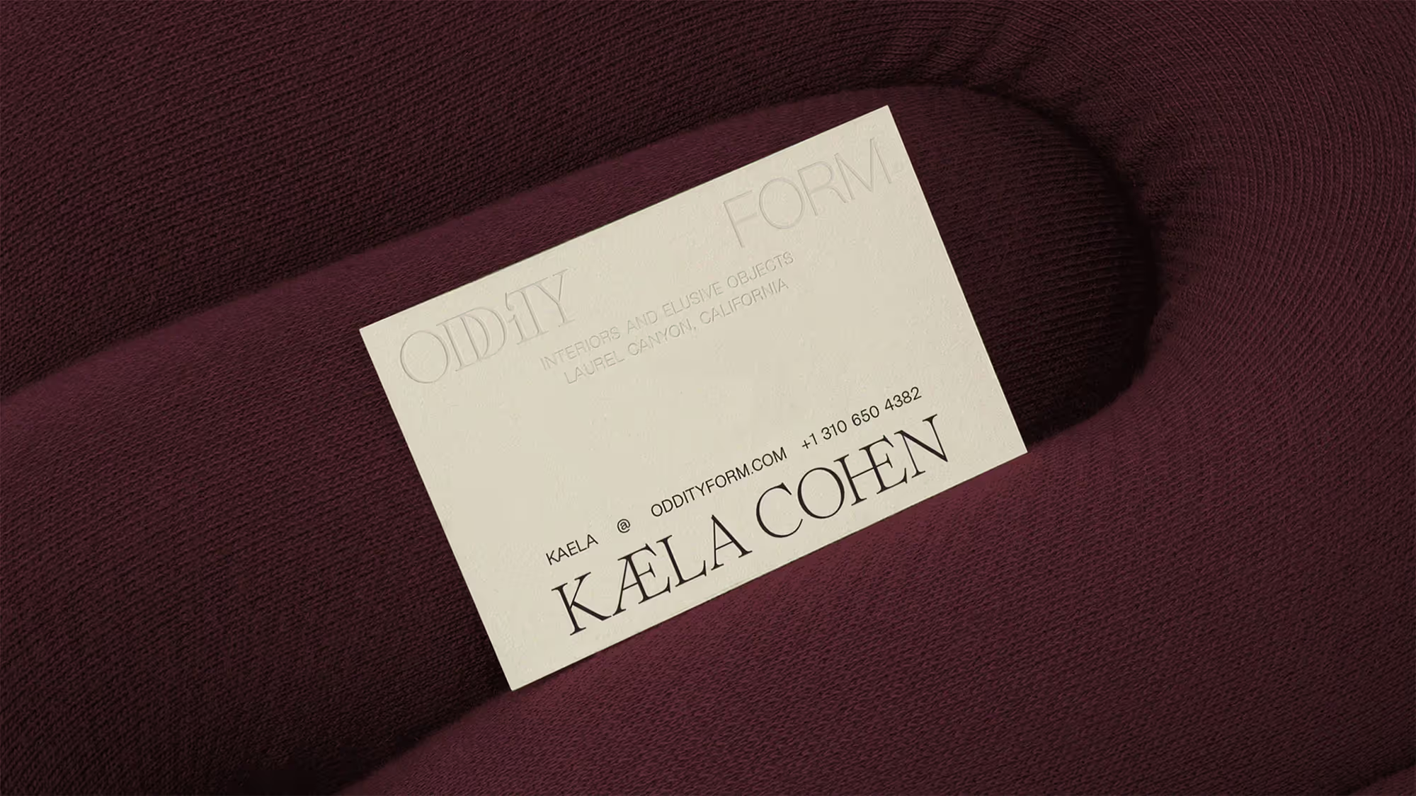
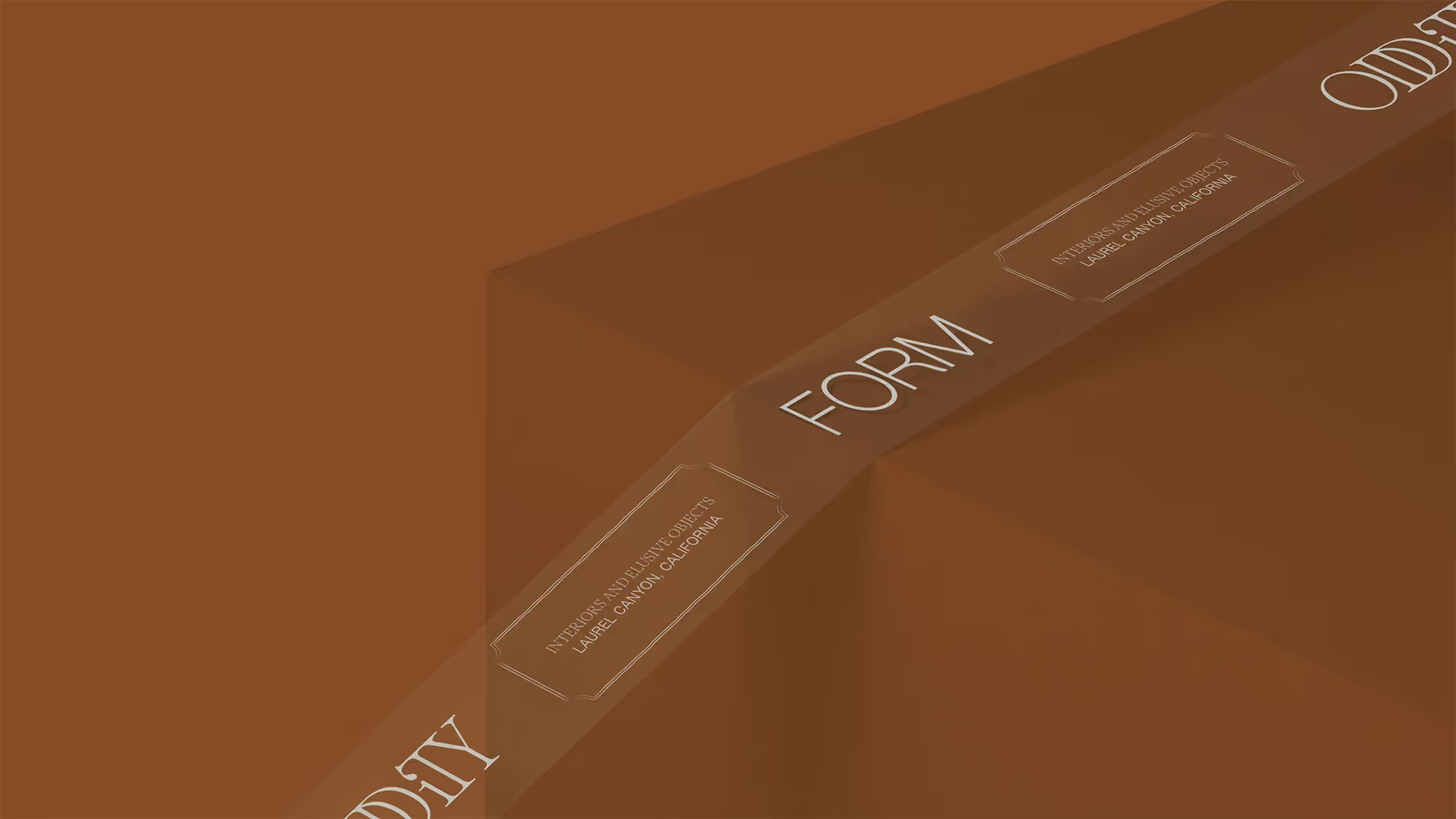
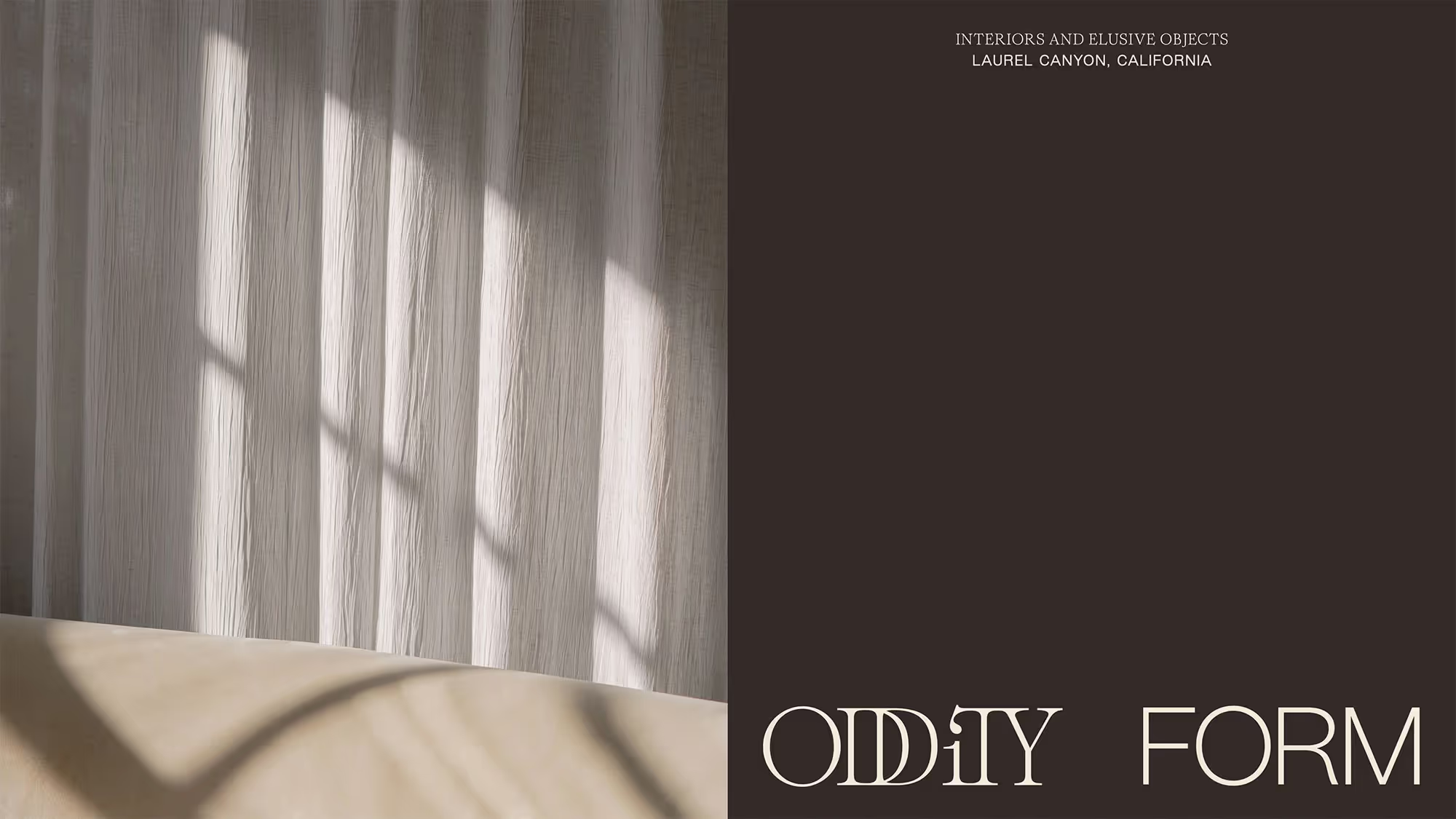
A small but versatile color palette combines in different ways to signify luxuriousness, clarity, or vibrance. Slender typography balances the written word between two worlds: an ornate 18th-century French-style transitional serif, and a paired-down grotesque that leverages 19th-century layout trends.
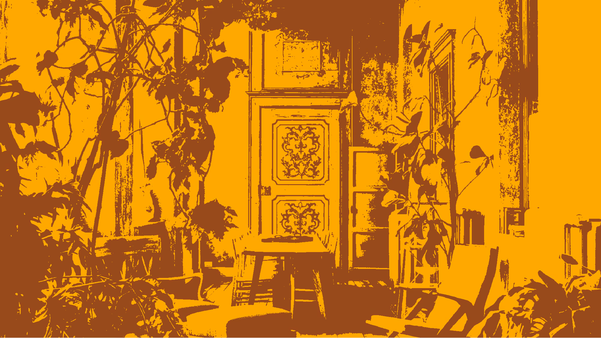
French wall paneling, reinterpreted in line-work, give the brand a content system that aligns equally with elegance and minimalism. They offer a handcrafted warmth that can be applied to any surface. Photography, repurposed as textured ‘wallpaper,’ lend applications a French touch, when needed.
