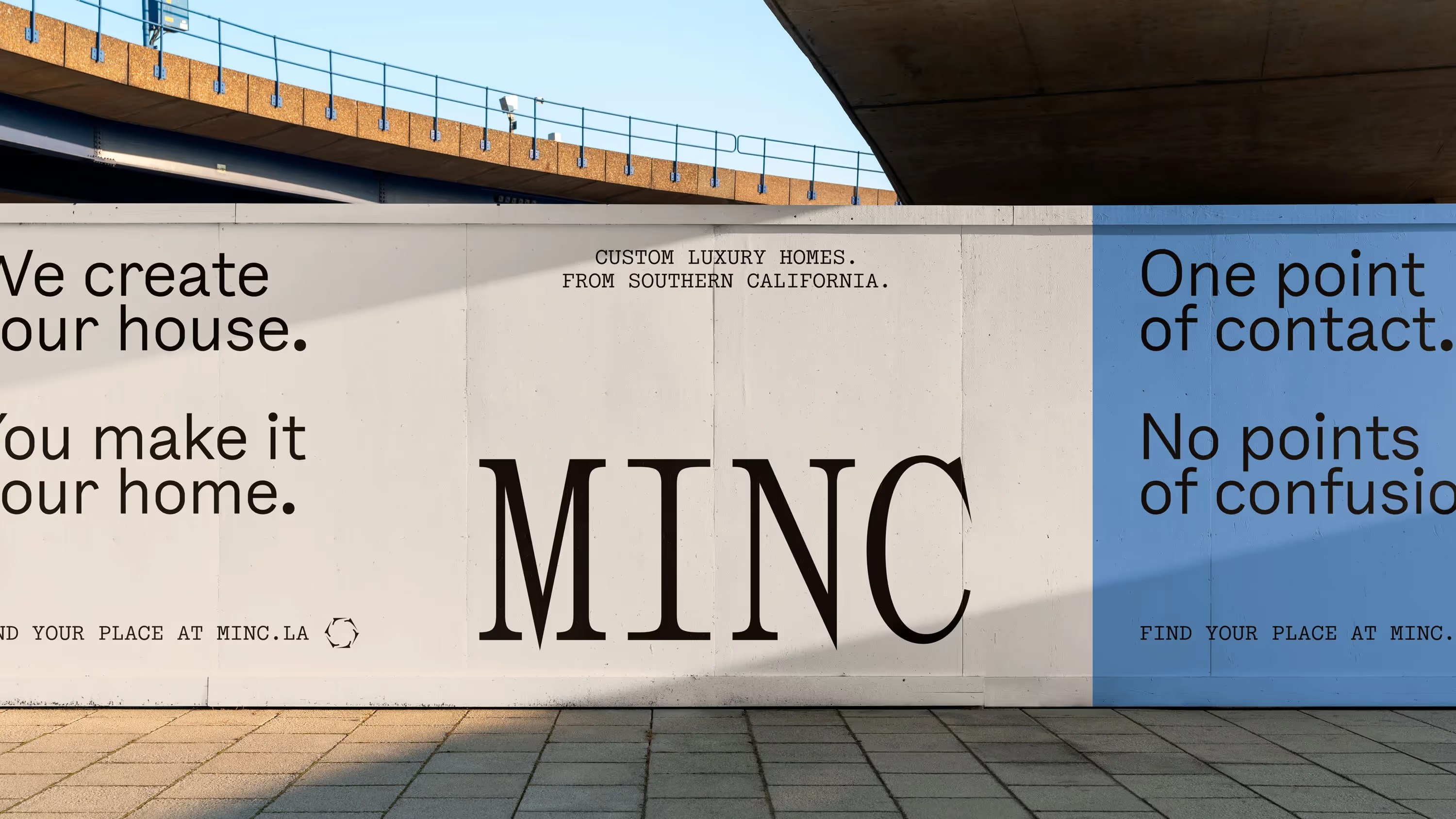

The housing market in Southern California is ultra-competitive. Home-building can often be seen as an opportunity for the builder to make money, rather than create homes that last, or fit their surroundings. As an LA native, David Minc is changing that.
We worked with David to build a brand narrative, visual identity, and a website for his luxury home-building business, Minc.


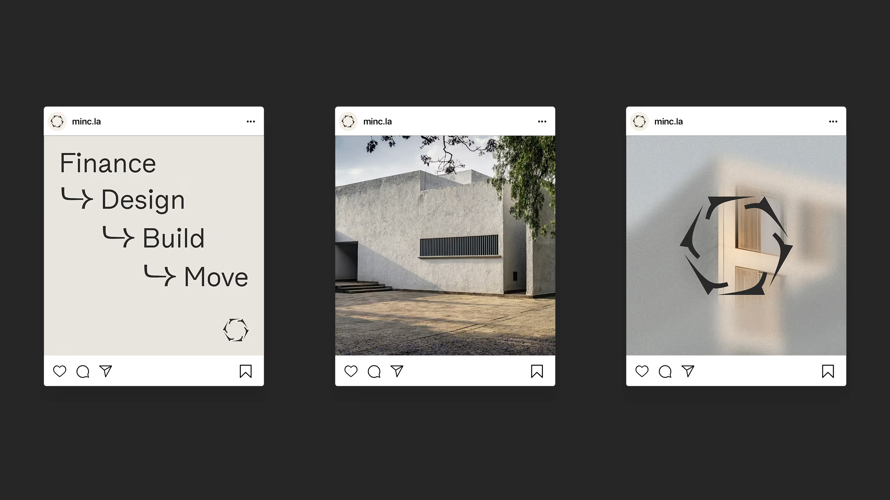
Although buying a home is one of the most significant acts in a person’s life, the process is often opaque. Because of this, it was vital for Minc to have a transparent and trustworthy narrative. We had several conversations from this starting point, leading us to a simple vision for the company:
To create houses where people belong, so they can build a home.


Minc has a unique business model where they can finance, design, and build homes; typically, at least two companies split these jobs. This streamlined model means they can create higher-quality homes with better materials and more precise craftsmanship.
Along with the narrative of transparency and vision we built, this business model also positions Minc to fill an important role in the SoCal housing market – one where the objective is building communities, not subdivisions.

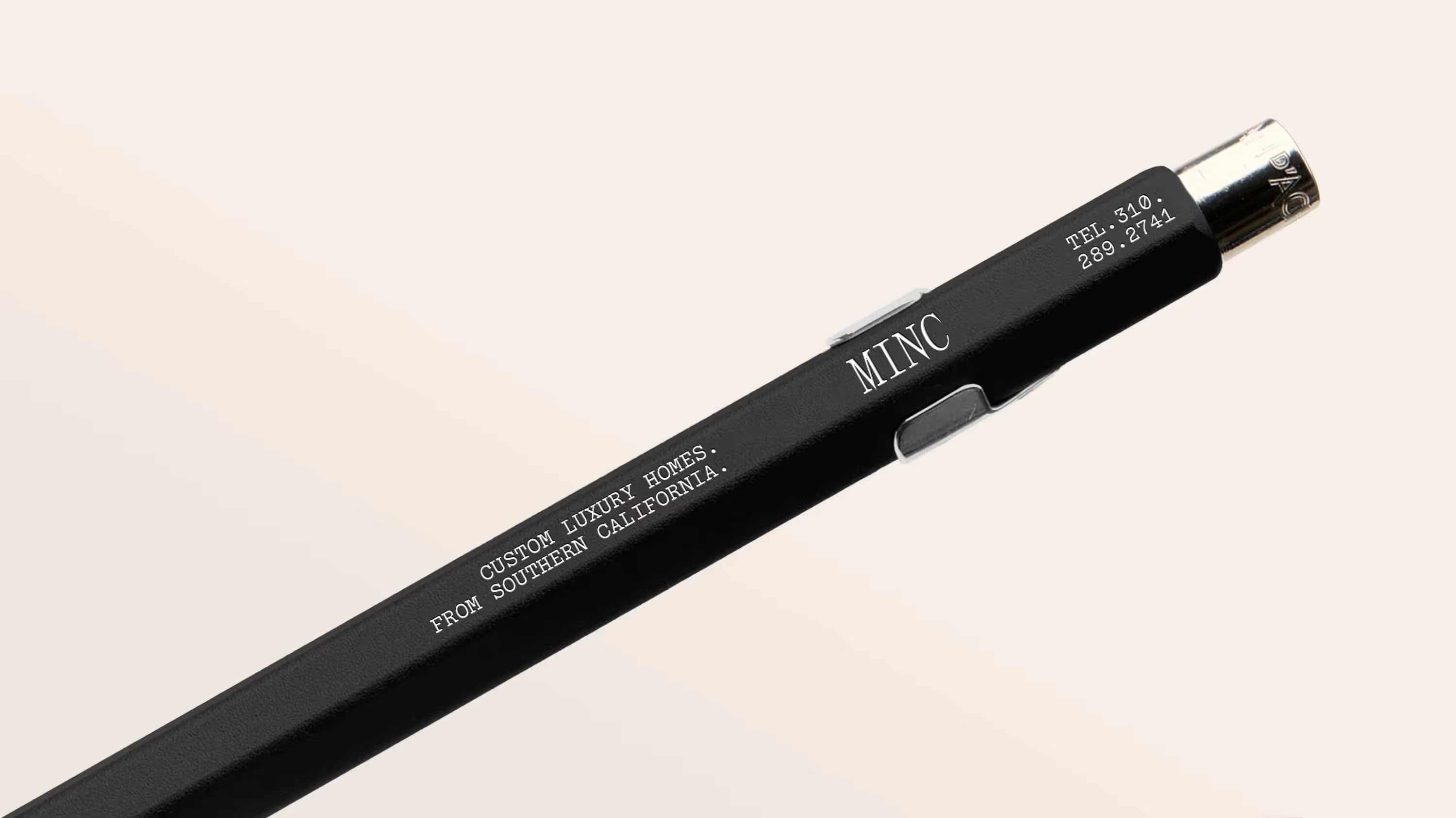
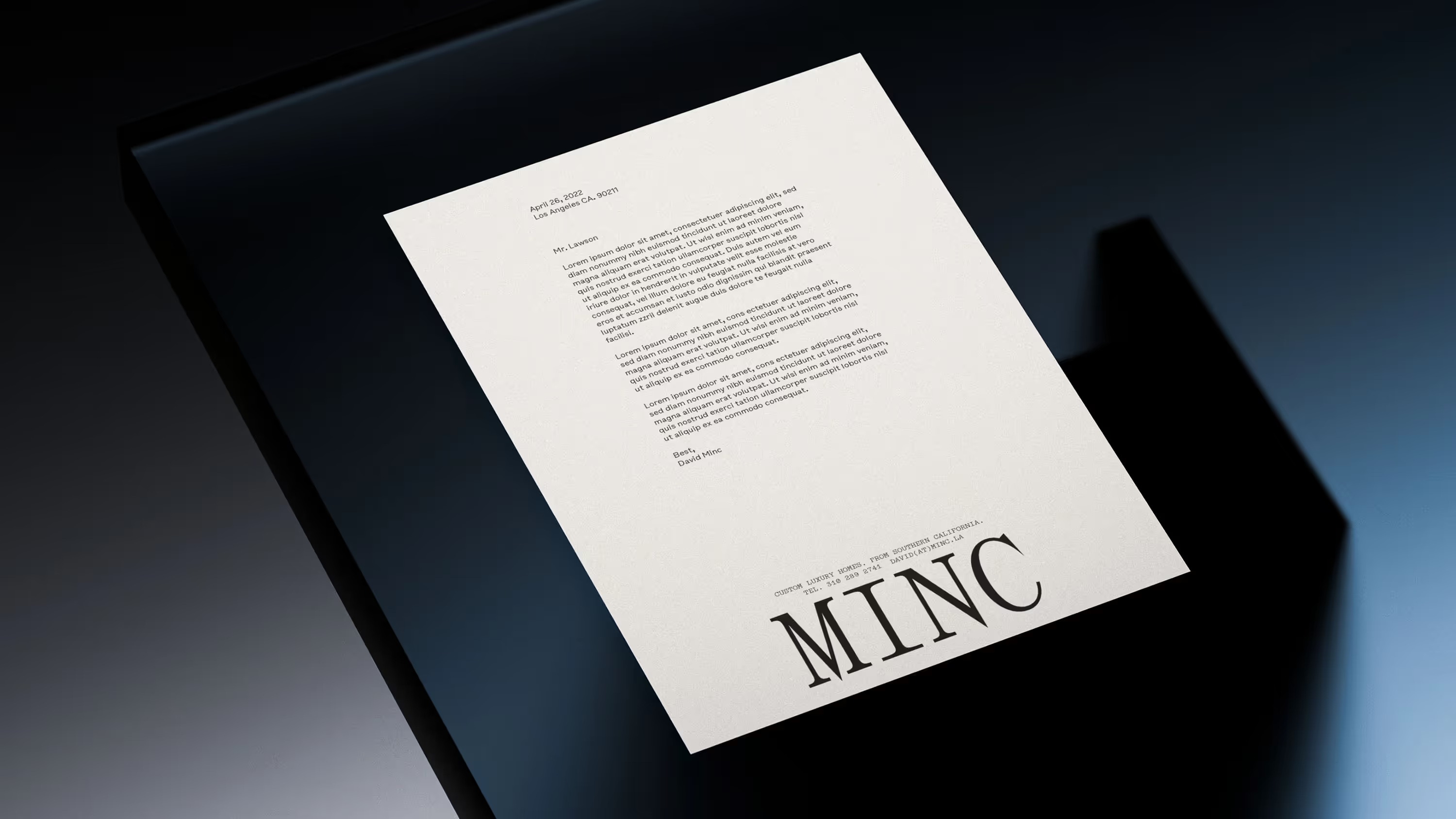
We based the visual identity on essential construction elements, dependable typewritten aesthetics of yesteryear, and clear vision.
Across the brand, blurred elements create depth and interaction with the user, visualizing the idea that the process becomes apparent when working with Minc.
Concrete, steel, and the sky inspired the primary brand colors. Fluorescent green and orange spotlight importance across the brand, lending a pragmatic balance to the neutrality of the primary colors.
Clarity and loyalty are expressed through hand-typed typography, graphic ‘workflow’ arrows, and straightforward copywriting. A hex-nut icon communicates multiple business values: design, construction, and trust.

Panama Monospace
Simon Mono
Bull-5