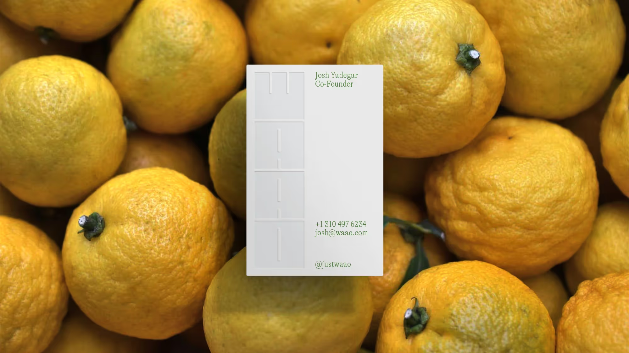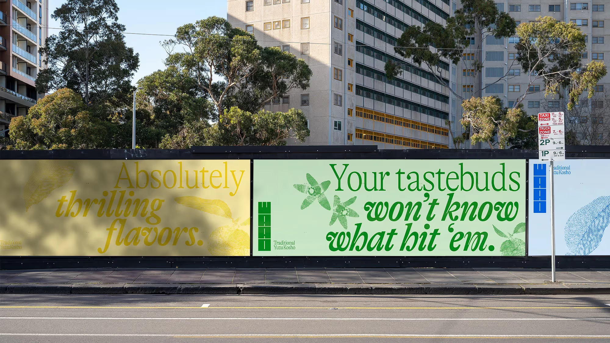

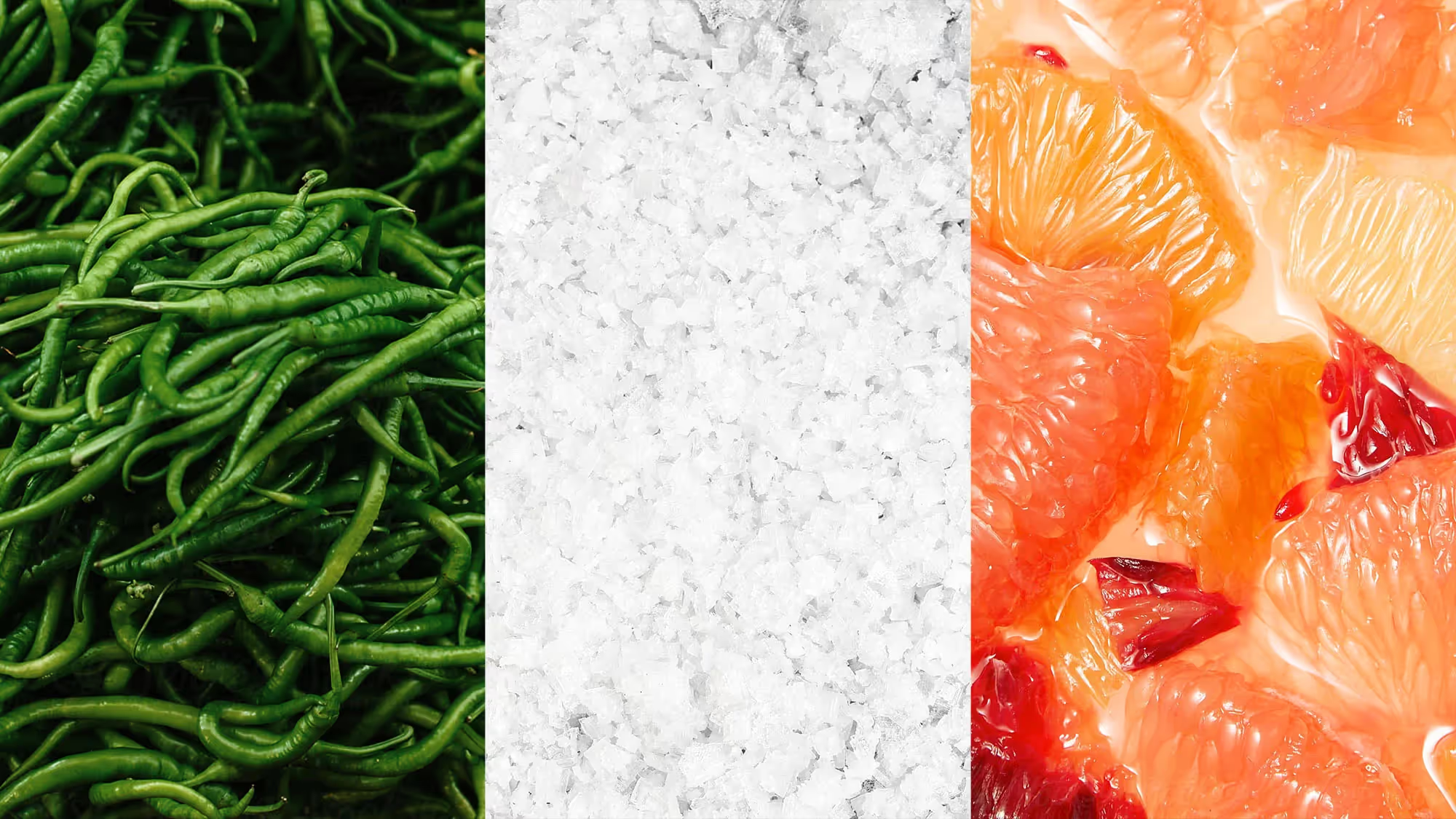
Yuzu koshō is a Japanese specialty condiment made from fermented chilis, yuzu citrus, and sea salt; Waao is a contemporary take on the traditional recipe. Working closely with the two partners, we explored how the brand could reflect this dynamic, inviting new audiences while respecting the condiment’s culinary history.
The heart of the brand became the idea of ‘Exhilarating Tastebuds.’ Along with a tone of voice centered around vibrancy and enthusiasm, this thought guided us toward our goal. At its core, Waao wants to give dimension to life. To open people to diverse, engaging, and exceptional culinary experiences.

Instead of a point of divergence, the brand needed to be a link between past and present; we chose to be vibrant and experimental among a field of competitors that relied on tradition, but we didn’t want to let that notion make Waao feel inauthentic.
As a more profound counterweight to lighthearted references to flavor and dimension, we captured the textures of yuzu through the traditional image-making method of woodblock printing. This way, the brand communicates excitement and surprise but finds warmth through the physical elements of yuzu and Japanese history.

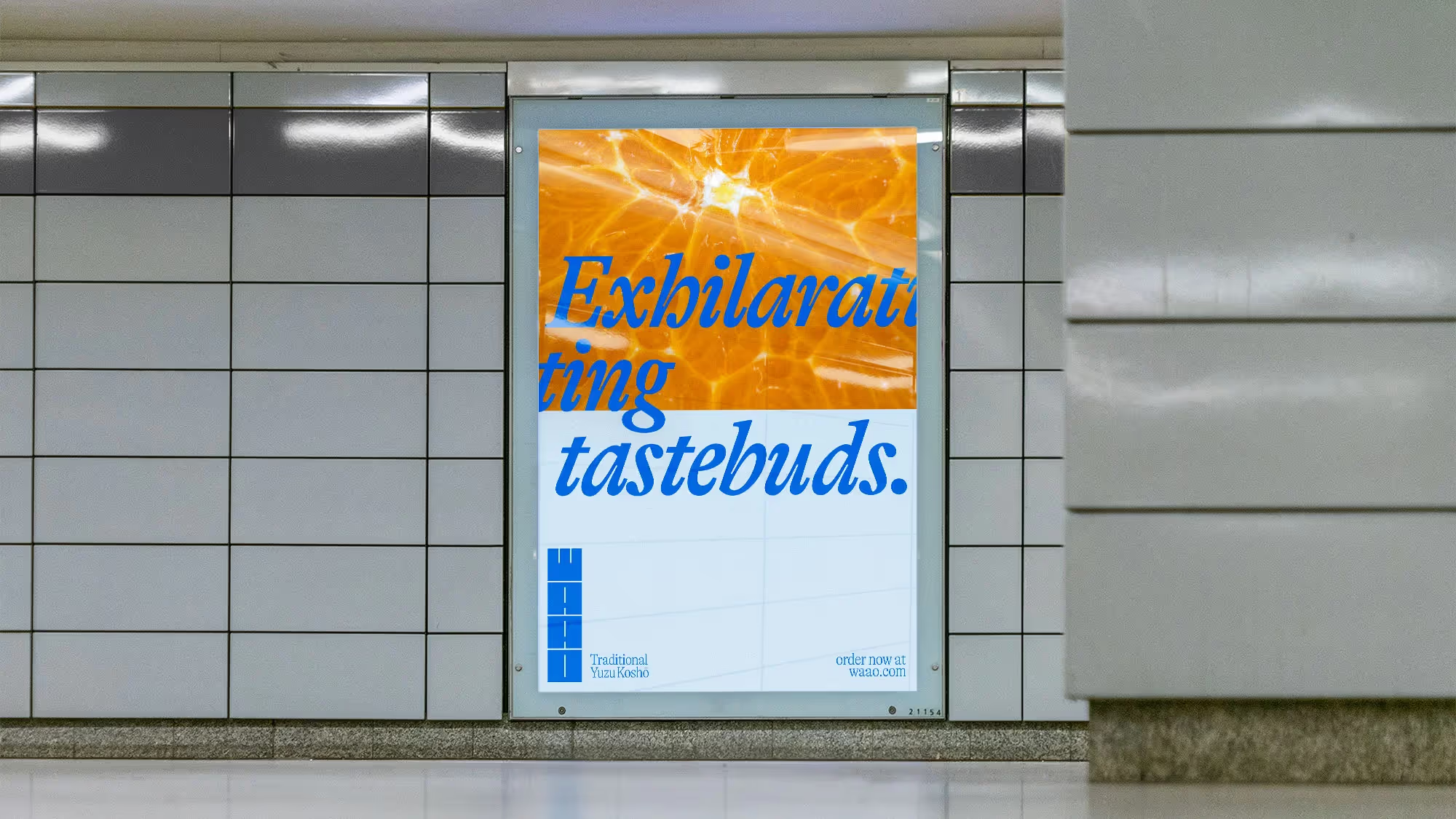

In addition to a Strategic Narrative, we built a Creative Narrative that included naming, tone of voice, and baseline. The name ‘Waao’ phonetically references a person’s reaction when tasting yuzu koshō for the first time. Simple, memorable, and to the point. It also appeals to Western audiences, who are likely unfamiliar with the condiment and its typical naming tendencies.
Inspired by the traditional ingredients and modern flavor experiments, the colors also reference the balance between old and new. The brand is impactful in motion and captures the foundational values of Passion and Excitement laid by the Strategic Narrative.
