The climate crisis is pushing the design industry to change. It’s not enough that the design industry helps its clients communicate or clarify, sell or improve—it has to do so with a climate perspective. And so do designers in the industry.
Otherwise, a self-initiated project of Yonis, helps designers—who often struggle to integrate a climate perspective into their work—learn about their cultural, ethical, and ecological role in the climate crisis. As a new business, it needed to not only stand out from the start, but prepare for what’s down the road.
We developed a Strategic Narrative, Creative Narrative, and Brand Identity to help the brand succeed. A custom website is forthcoming.

Across the climate sector, sustainability is talked about from a technical point of view. LCA, ESG, net zero. These concepts are often rational and reasoned, leaving out the emotional, corporeal, and communal side of life that is so important to a sustainable transition.
This yawning gap keeps people from fully believing in sustainability and creates resistance to it becoming a wider movement; it leaves out the cultural aspect that is at the base of the issue.
Accompanying this left-brained approach, branding in the sector is often technical and serious, leaving little room for the expressiveness that comes with a closer relationship with nature.
This lopsidedness left us with the opportunity to create an inviting narrative and warm identity that capture viewers’ imagination rather than lull them to sleep. It was clear we needed to make the mindset shift of sustainability fashionable, fulfilling, and enjoyable.
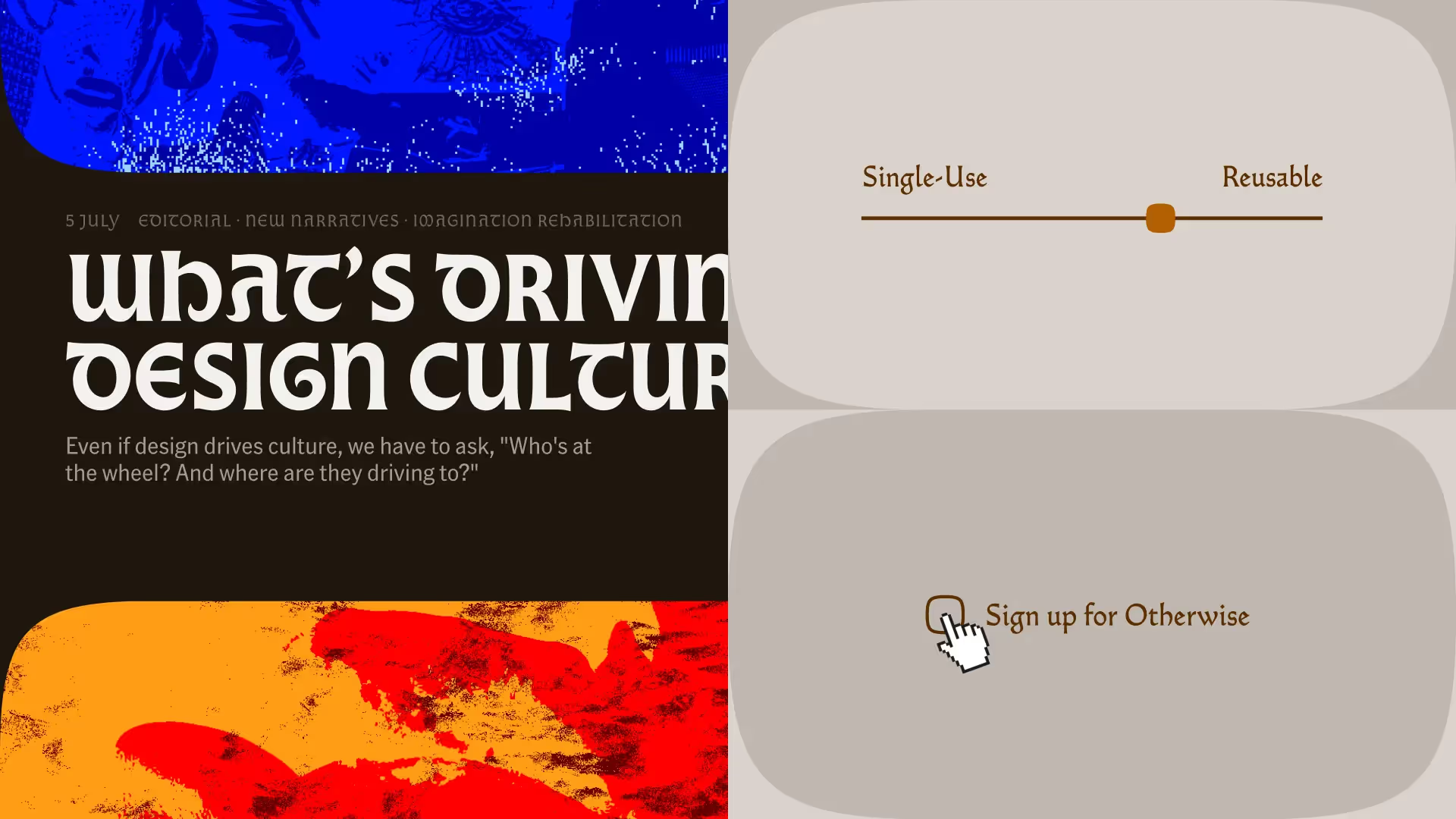
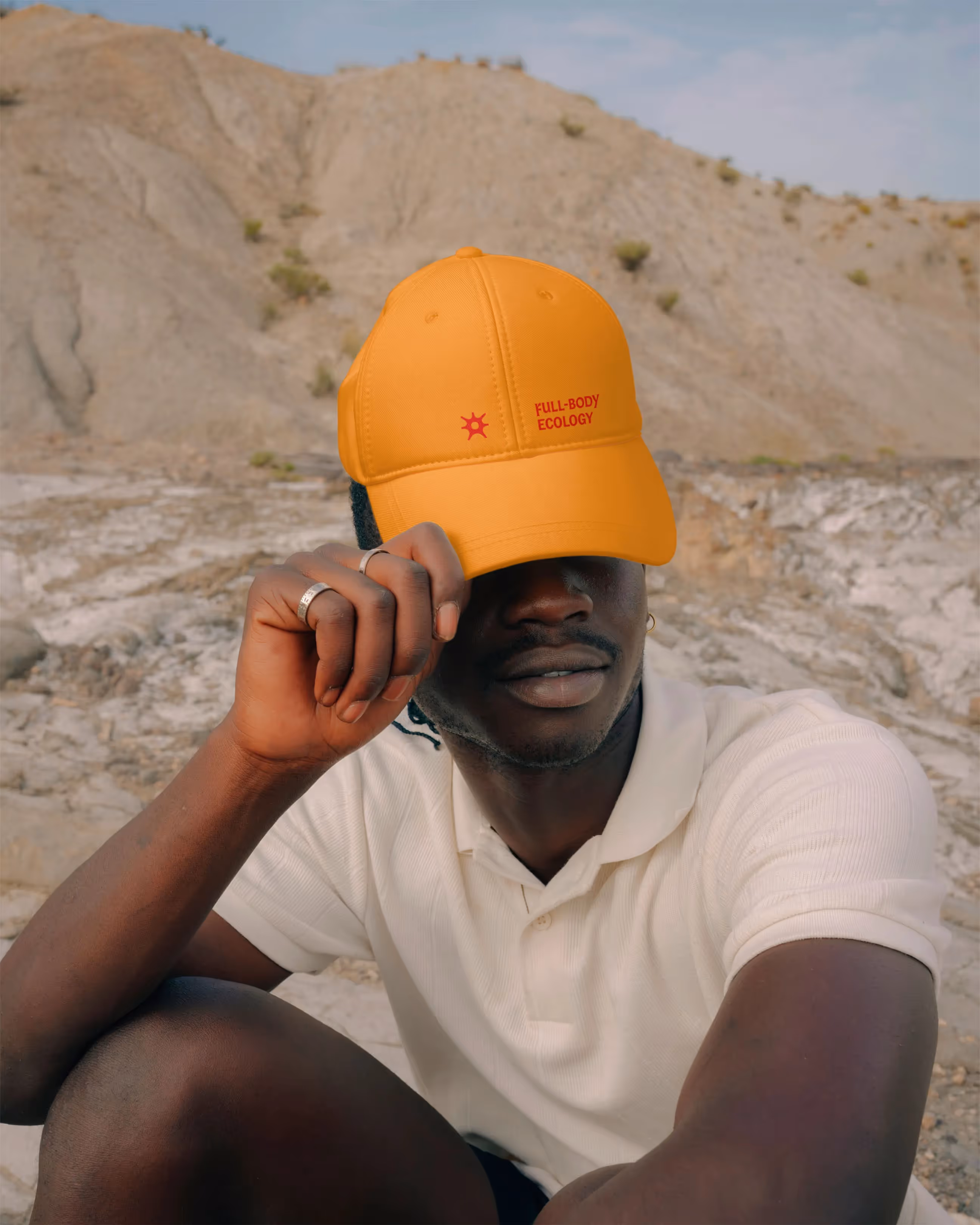
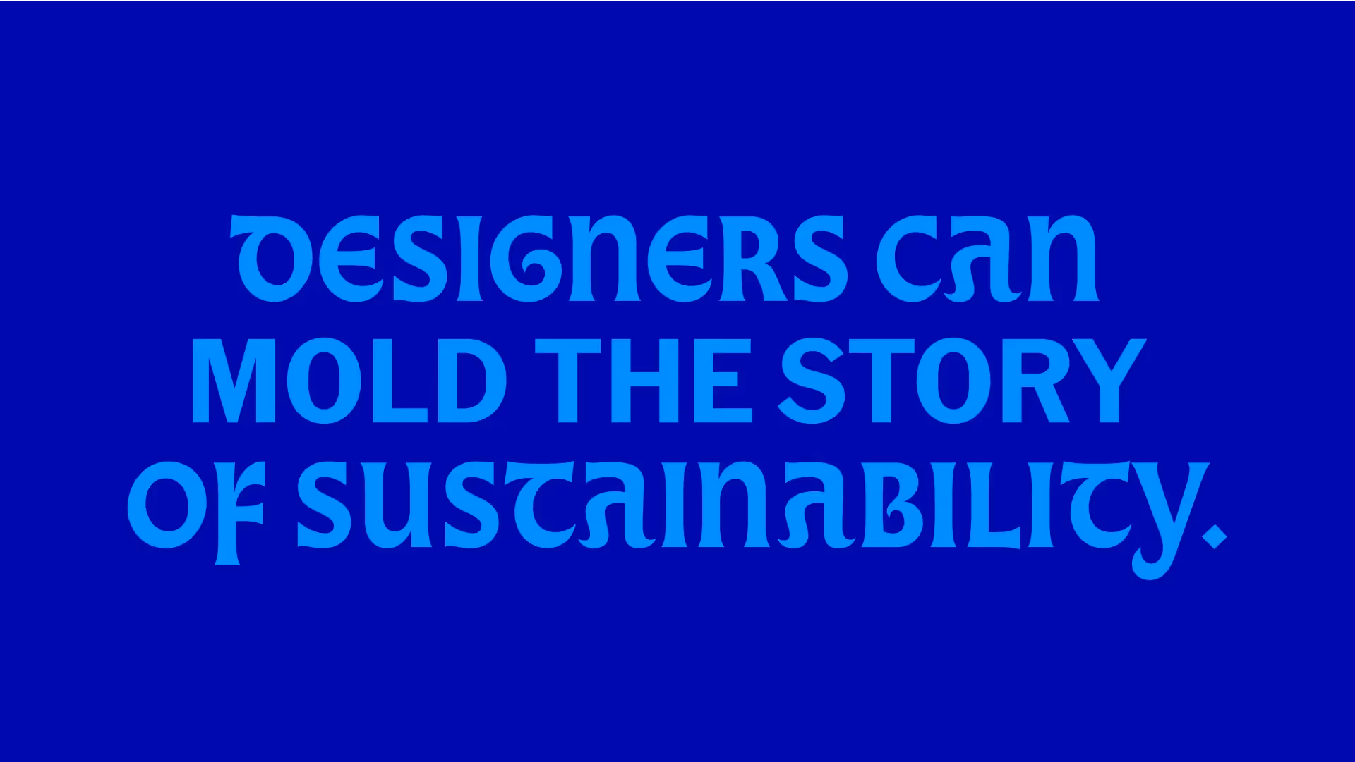
Taking all of this into consideration, we built the brand on the idea of “full-body ecology.”
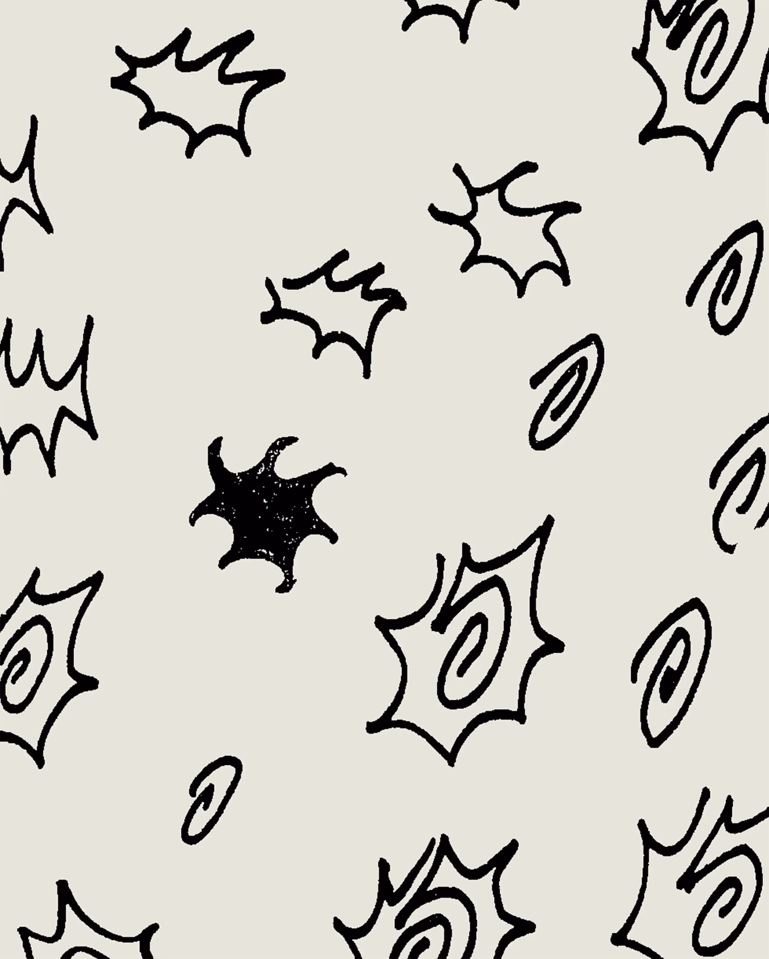

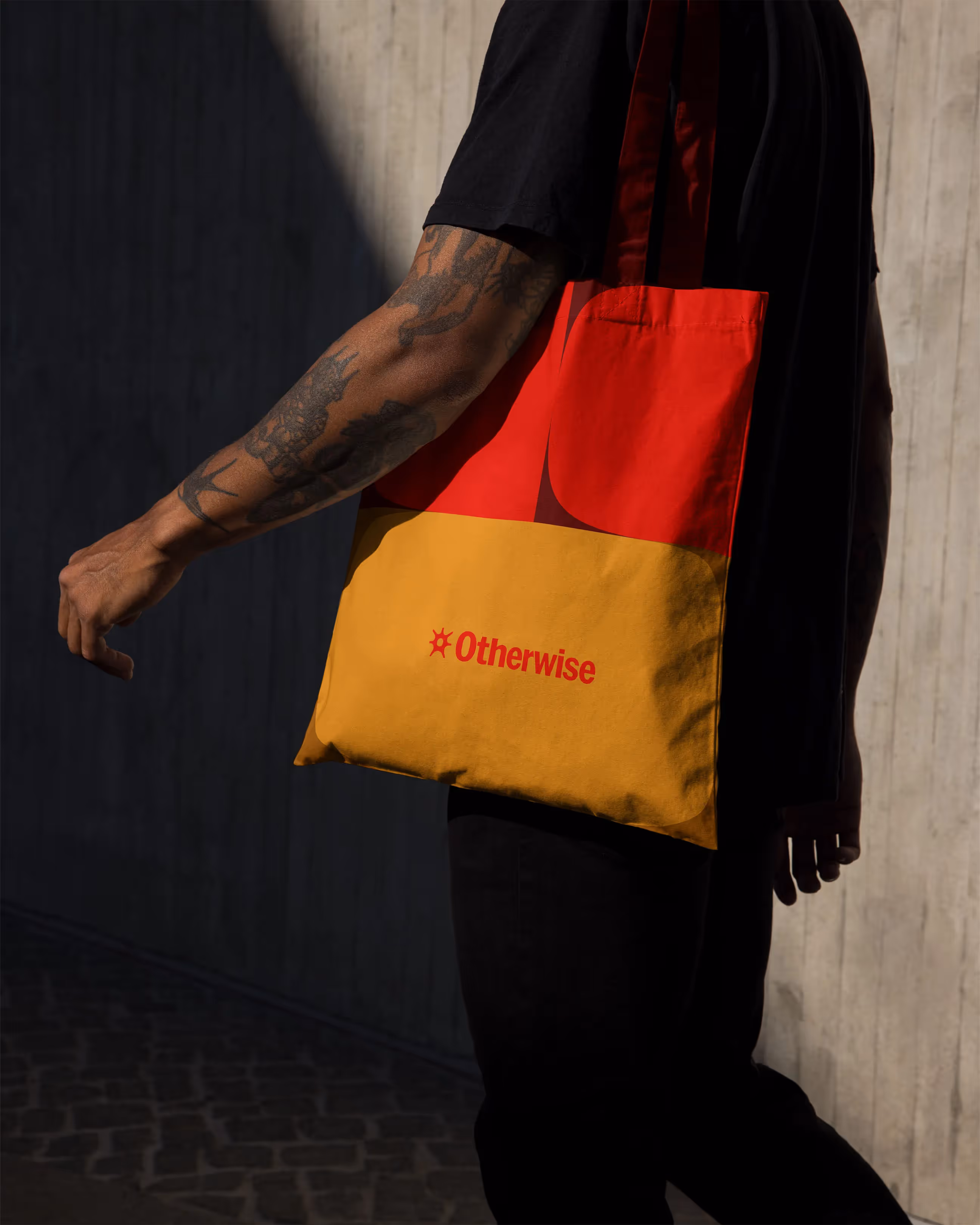

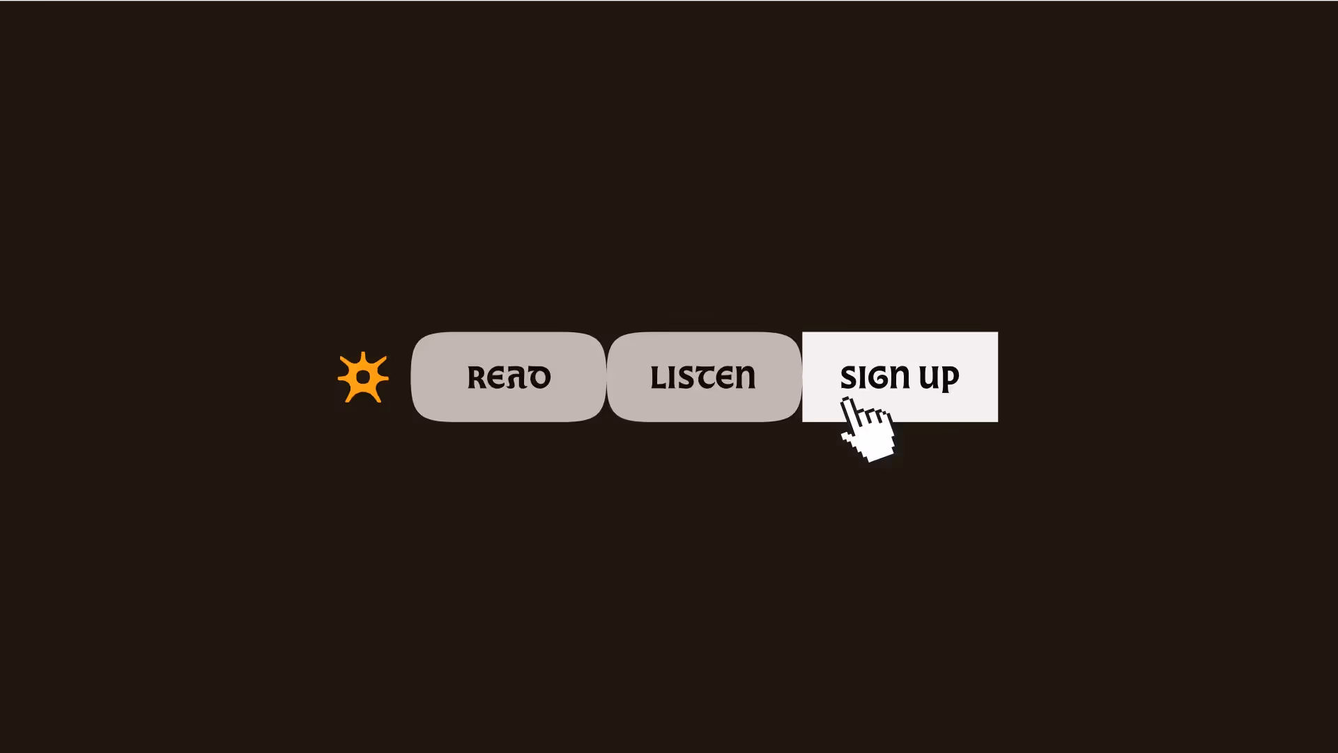
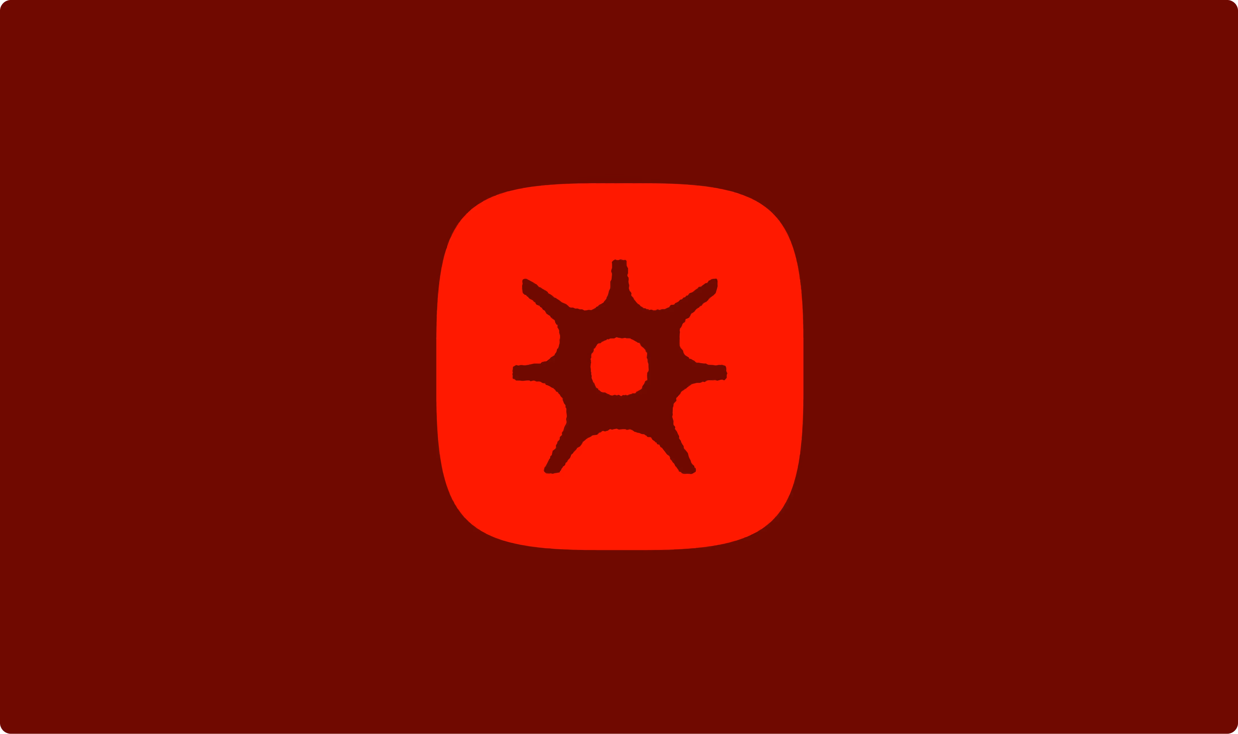
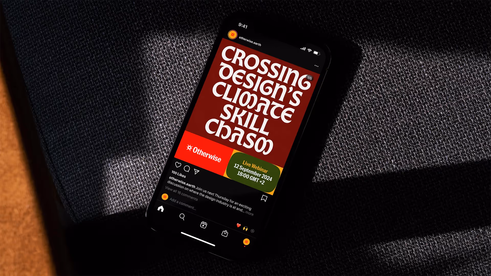
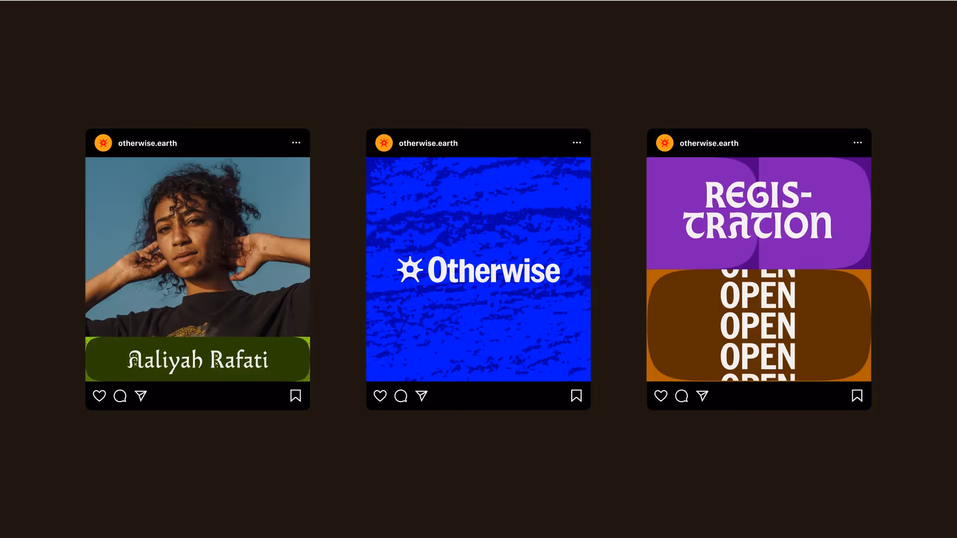
A squared squircle is the base of a graphic system that plays with the idea of taking up more space, feeling with your whole body, and integrating a climate perspective. It can be combined in myriad ways to create backgrounds, patterns, containers, and more.
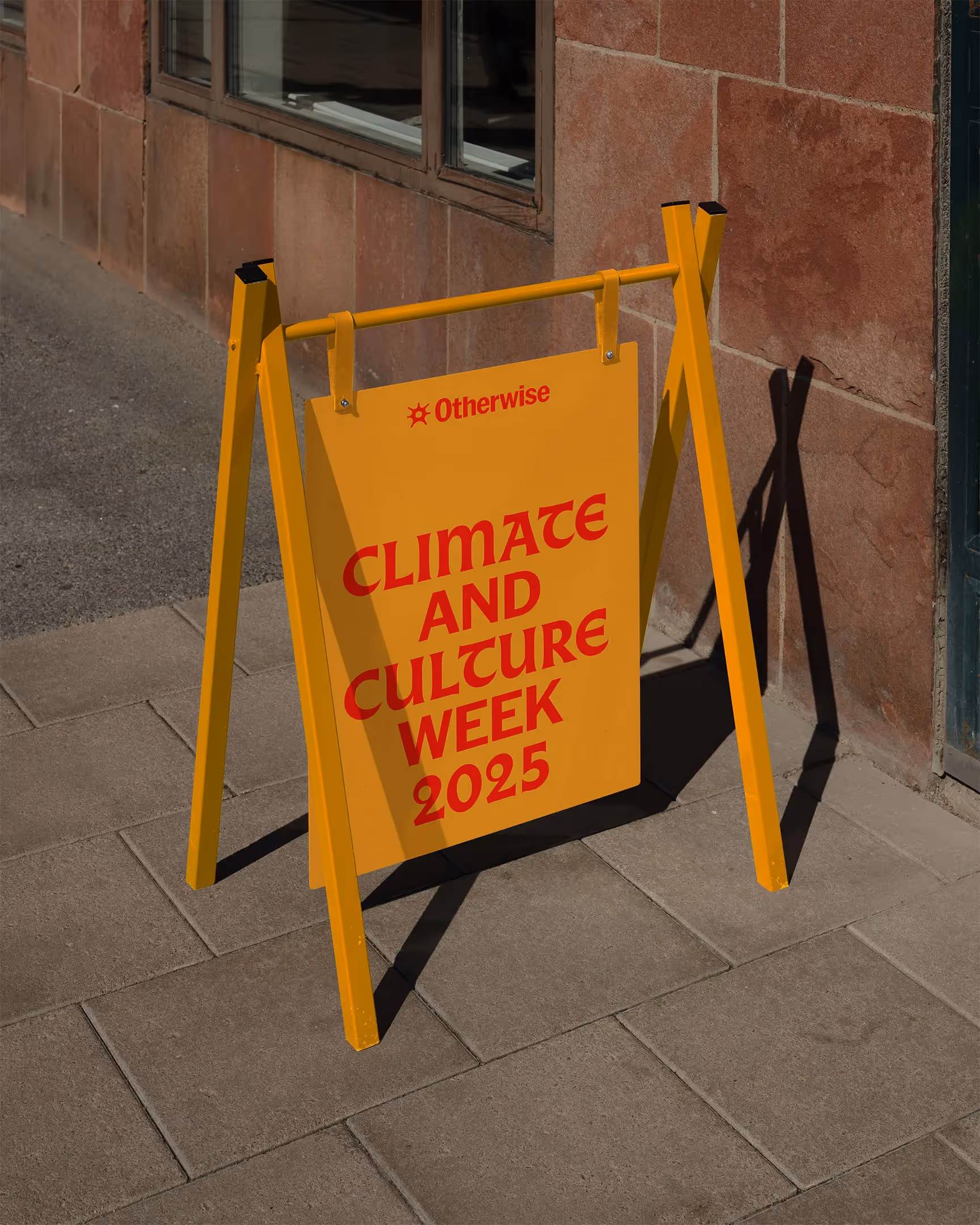
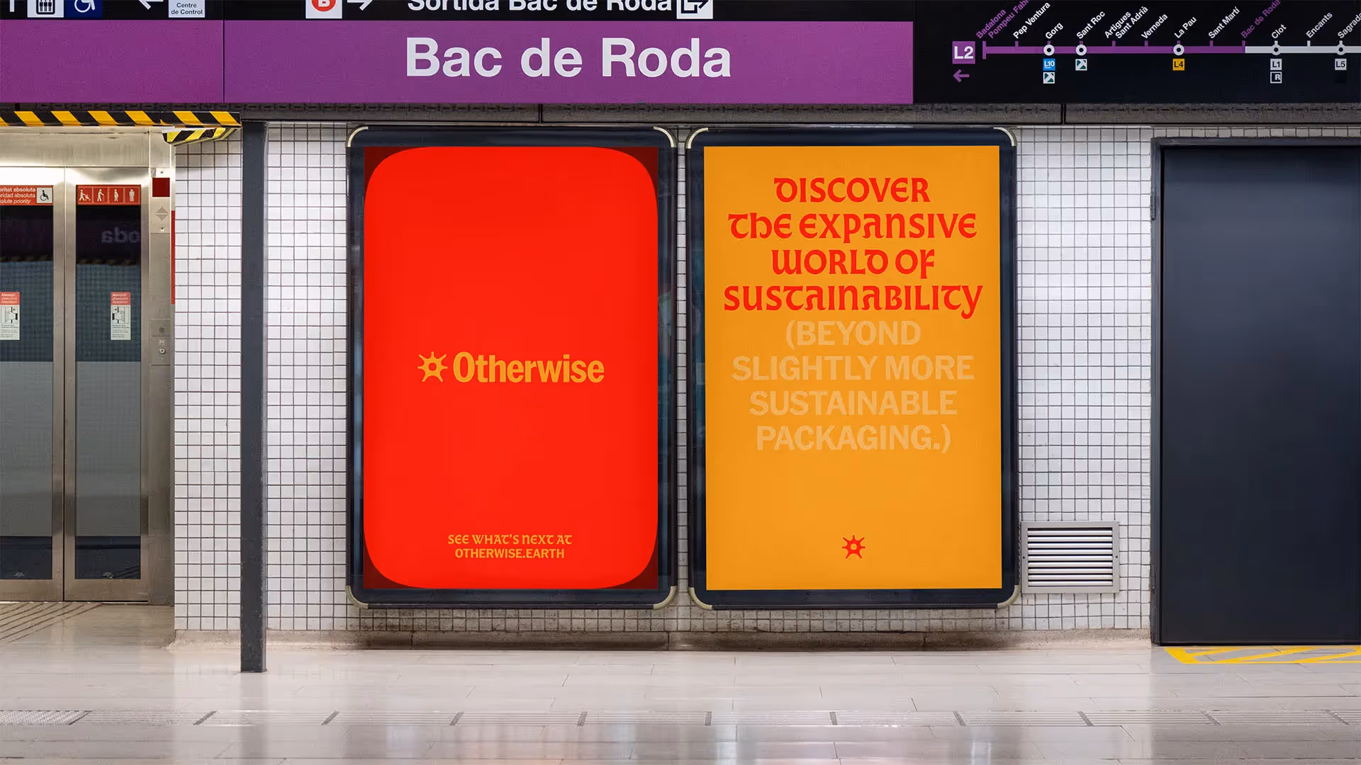
Meanwhile, a broad color palette creates the canvas for a wide variety of expressions—almost none of which involving only blue or green. With yellow and red as the main colors, the brand nods to the severity and abnormality we see in modern-day earth systems, and hints that part of the solution is to understand the world through the many relationships we create with the people, plants, animals, and elements around us.
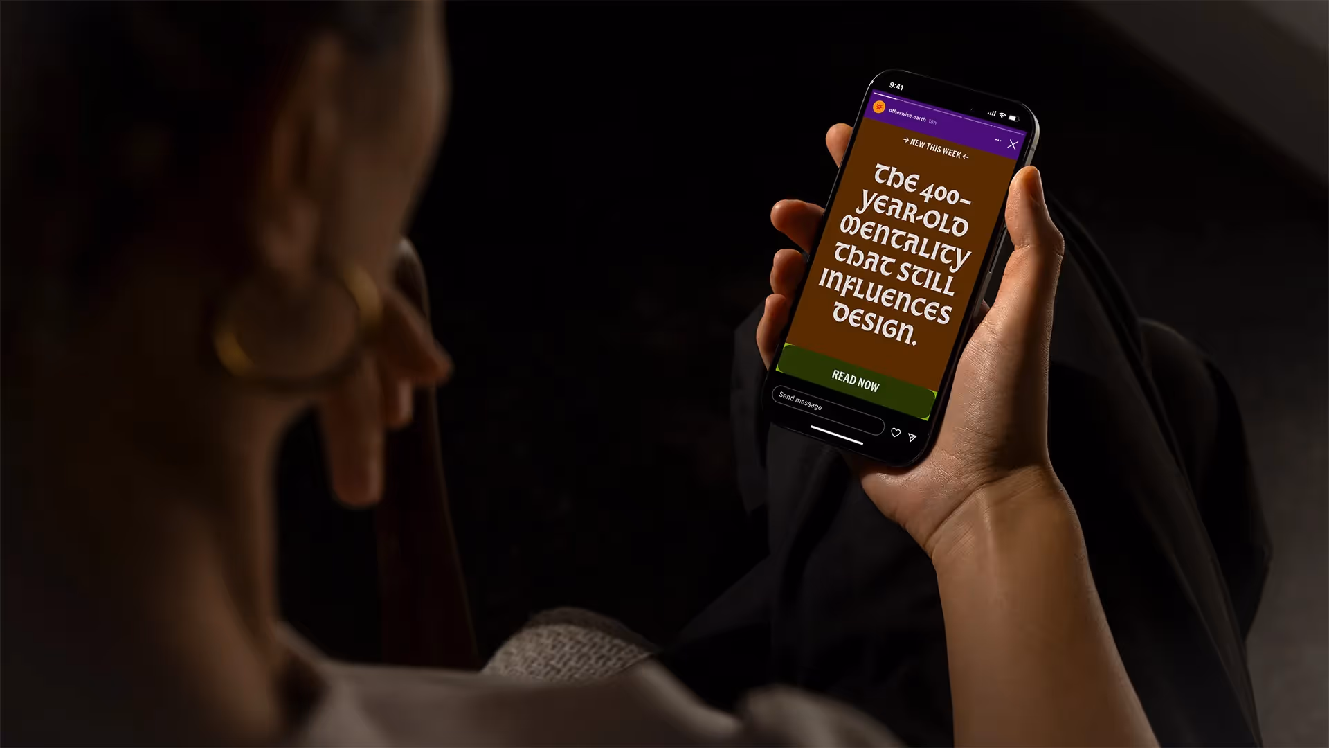
A simple typographic system accompanies these shape and color systems to play between two worlds: the new world of technical achievements and progress which we’re so accustomed to, illustrated by American Grotesk, and the old world of sufficiency and interdependence to which we need to reconnect, illustrated by Almost.
Otherwise helps set a new metric for design beyond economic growth.